
.jpg)
Your logo is often the first thing prospective clients notice about your business, whether they spot it on the high street or on Instagram – which is why it’s crucial that yours makes an impact. We chatted to a range of award-winning business owners, and even a public relations manager, to find out what they think makes a great logo and what the design process looked like for them.
Hayley Snishko, owner of Home Sanctuary in Surrey
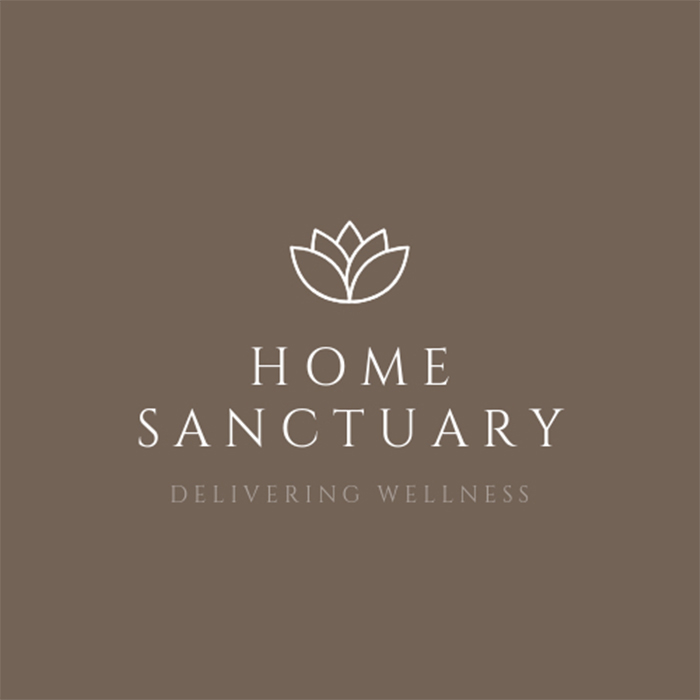
“My logo has evolved over the years as my business has grown. The original version of it was the roof of a house over the words ‘Home Sanctuary’, representing the fact I visit people’s houses for treatments. Over time, I found myself moving away from that design and chose a simpler logo that felt more in line with where the business had naturally progressed.
“For me, a great logo is all about how it makes people feel. My business is entirely word of mouth, so my logo isn’t designed to attract new clients through advertising. Instead, I wanted it to instil trust and a sense of calm in people who’ve been referred to me. That initial impression – feeling reassured and welcomed – is really important.
“When I had the original house-style logo, I was driving through town and spotted a builder’s van with a very similar design. I realised I didn’t want my logo to be mistaken for a builder – or anything else outside the wellness space – or anything too similar to another business.
“That prompted the shift toward a cleaner, simpler style that felt more unique and aligned with what I offer.
“My first logo was created by a designer who specialised in branding for our industry. He came highly recommended through a therapist forum I was active on at the time. I had a clear idea of what I wanted in terms of design, colours and font, so while there was a bit of back and forth initially, he got it right pretty quickly.
“When it came time to redesign, I actually did it myself. I spent a fair bit of time experimenting, but I knew I wanted something simple and clean, so the final version came together fairly smoothly.”
Paula Clipsham, director of The Hart Spa, Sevenoaks
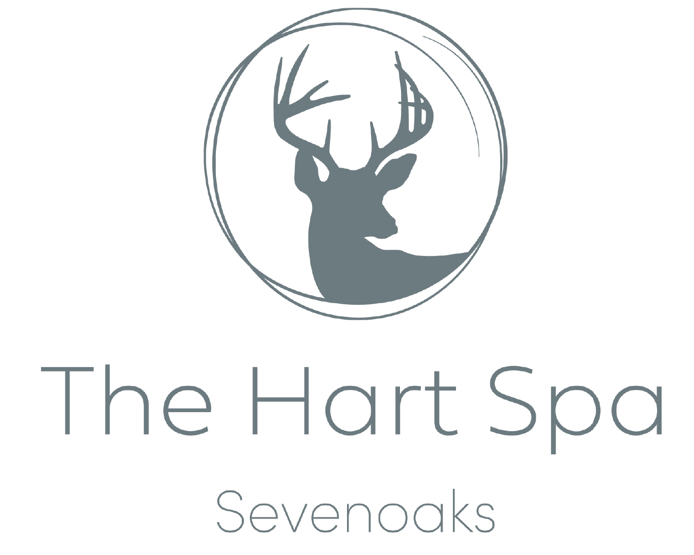
“The Hart Spa is based in Sevenoaks, right next to Knole Park – one of the largest deer parks in Europe. I walk in there every day and have done for over 25 years. I still smile every time I see the deer, especially when the fawns are born.
“For 10 years I lived close to The White Hart pub, and when it came time to our rebrand, I knew the name The Hart Spa felt right. From there, the idea of including a stag in the logo came naturally – it’s such a special part of my everyday life.
“I knew from the start that the logo had to feature antlers. But most stag imagery is very bold and masculine, and that didn’t feel right for the spa. I wanted the logo to feel soft and elegant, with a feminine energy that still carries quiet strength.
“I wanted to make sure the logo stayed simple and clean, especially as it would be embroidered onto our uniforms. The logo needed to reflect the calm, nurturing atmosphere of the spa, something delicate and graceful felt much more in fitting with my vision.
“When it came to designing the logo I was very lucky, as my son and daughter-in-law are both designers. Harrison started out in graphic design, and Katie is a design technology teacher. They both helped with the salon rebrand in 2021, including the website.
“We did go back and forth a little with the logo, but I had quite a clear vision. Harrison added the beautiful swirl, and it brought everything together perfectly.”
Becky Lumsden, chief executive of Pure Spa & Beauty
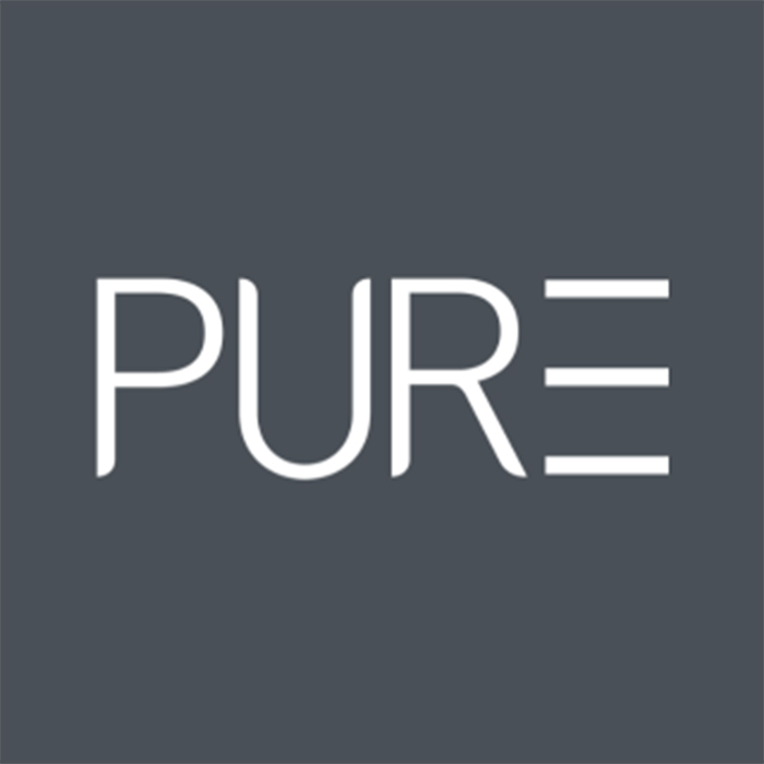
“I was actually going to call the salon ‘The Nail and Beauty Zone’, but at the last minute I decided it wasn’t right. I then switched to thinking about what we were trying to do as a business and decided that PURE Nails and Beauty would be better suited, as we were trying to be an accessible brand – simple and focused on the customer experience.
“At the time there were a few businesses using ‘pure’ in their names, and while not in our sector, I thought it couldn’t hurt to be different – so I decided to use the French spelling, as I had lived in France.
“The French word is pur with no ‘e’ – but it looked a bit confusing. I had a close friend who was a graphic designer in the music industry and when I was discussing it with him, he suggested using the 3 lines after to make it look like the word PURE without the letter ‘e’.
“He came up with the design and our logo has lasted over 20 years. Tragically, John (the designer and my close friend) died suddenly at the age of 50, but his talent and designs live on and I am reminded of him every time I look at our logo.”
Naomi Scroggins, hair and beauty public relations manager
“Designing your logo can be such a fun experience, but with so much choice it can also be overwhelming. Think about who your customers are, and what might appeal to them; if your business is aimed at millennials, you might need something different than if your clients are in their 50s and 60s.
“The visual elements you use – be it text, a symbol, or a combination of both – are really important. It has to be something that stands the test of time while still being recognisable.
“We all know brands that are instantly recognisable, either because they've used striking typography or a symbol for a logo that can be easily adapted, and instantly recognised, no matter where they are used.
“Colour choice is imperative too – is this colour going to date, or is it a neutral colour that won't go out of fashion? Does it showcase personality that aligns with your brand?
“Sometimes logos work well when they combine a strong font with effective typography and a symbol, as this can communicate more about your business than text alone.
“It’s also important to make sure your logo is legible – especially if you are scaling it up for a storefront. You want it to stand out and make a statement to passers-by – especially those of us who don't have great eyesight!”

.JPG)
